vStyler vStyler

Venom - WIP

Venom - WIP

XP, Vista and Win 7

http://maxstyles.com/news.php

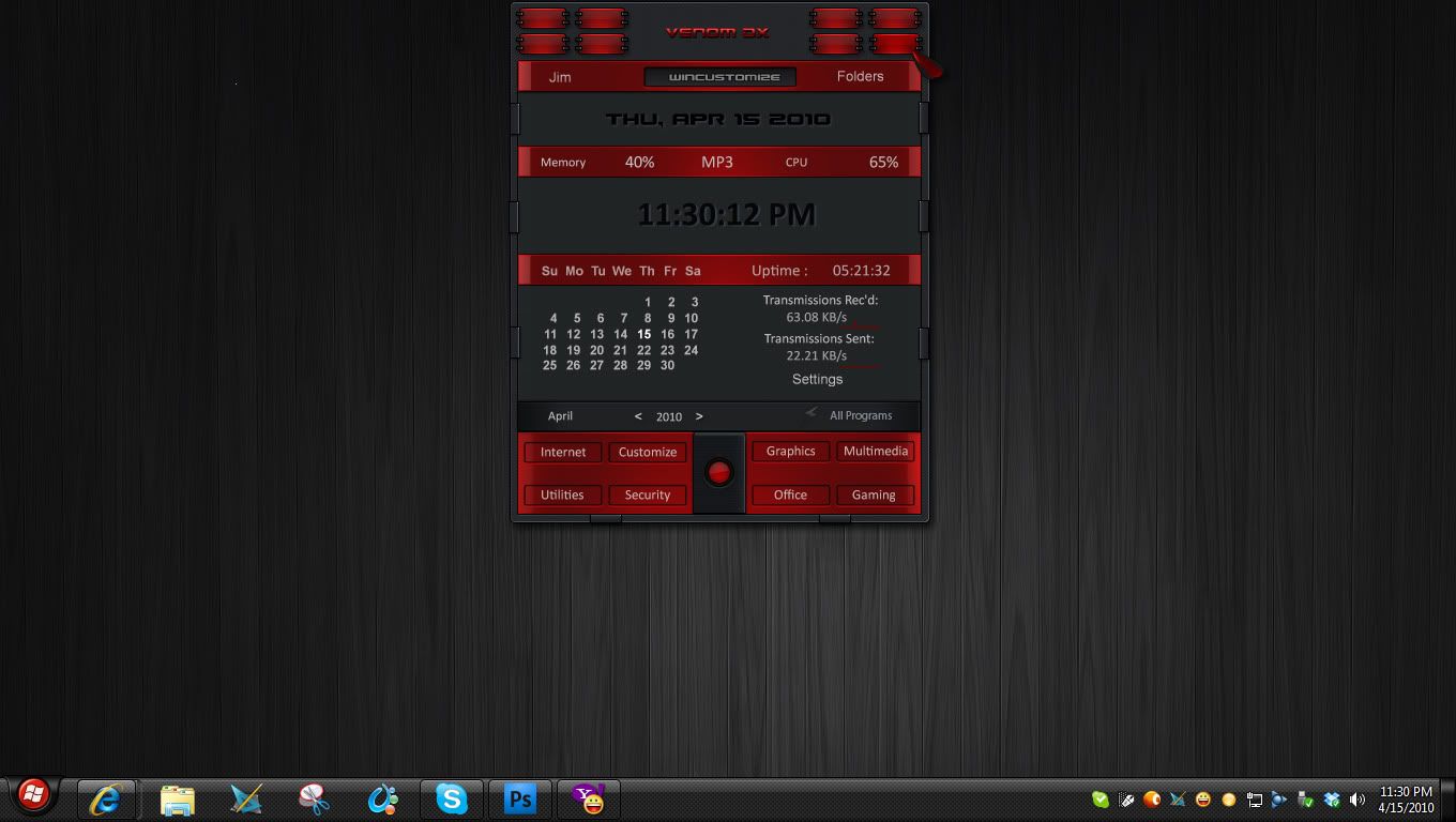
k, so the concept was to get as far away from the last theme I did as possible and still be able to skin Win 7 completely and correctly.


I also wanted to make a red and black theme that took advantage of the dramatic contrasts that this color combo can achieve.


Devilish, menacing, provokative, I dunno.. thats what is running through my head as I throw this PS mockup together.


I suppose X-( I will be doing a light and dark windows version as I dont see anyway around it...


...so this one may take a while to complete but here it is in it early.. fluid stage.


Oh and I may just keep the small branding text... cos I know :snowman: would approve  ;)


will post updates as they are formulated.


539,929 views 382 replies
Reply #176 Top

I think you're having a clarity/contrast problem with the red font, Jim.... to my ancient eyes, it's really hard to read. Otherwise lookin' good!

Reply #177 Top

Lookin good Jim, as far as the blue goes, I'll leave that up to you, but there isnt anything but red and dark in the theme, all mousovers are red glows.


Here is a short vid showing the titlebar buttons that I've spent bloody ages on. Hopefully it posts correctly, I think I'll start posting more vids like this now that I have a PC that can handle it.

Reply #178 Top

btw agree with doc on the red text, hard to read a wee bit.

Reply #180 Top

Videos now too, you never cease to amaze!  Those titlebar buttons are fantastic!  :thumbsup:


Reply #181 Top

ok i don't wanna see anymore!!! i can't bare seeing it lol because it's not out yet... :| oh P.S. don't get me wrong..i want to see more screeny!!! fantastic titlebar buttons! :thumbsup:

Reply #182 Top

Wow, love the little video, nice touch!

Reply #183 Top

Nice vid...volume too low, tho.  I'll change the red text.

Reply #184 Top

ok i don't wanna see anymore!!! i can't bare seeing it lol because it's not out yet...


  there ya go SpeciaLKey...... ;)

Reply #185 Top

Lookin good Jim, as far as the blue goes, I'll leave that up to you, but there isnt anything but red and dark in the theme, all mousovers are red glows.

That's strange...the mouseovers on my version of the blind are blue....:-" .

Reply #187 Top

Ok, here is now.  I may need to lose the net in/out due to script errors when run with DX 4.0. No more blue.

Reply #188 Top

here is now.


we have a winner :borg:

Reply #189 Top

Looking real good RND!  :thumbsup:

Reply #190 Top

skinnercam.... ......cool idea...


Yeah, i'm digging it, will get the volume levels better next time folks.

Thx everyone... :sun:

Reply #191 Top

skinnercam was cool...just dont turn the camera around... 8(| :grin:

Reply #193 Top

^_^


This is a great skin for watching tv on your pc late at night.

John...check your pinstripes on maxxed windows.(and see to your throbber) :blush:

Reply #194 Top

.(and see to your throbber)

Now that's a video we don't need to see.:-"

Reply #195 Top

John...check your pinstripes on maxxed windows.(and see to your throbber)


Maxed frames not done yet, typically do em after the uis frames..


Throboff :inlove: :smitten:

Reply #196 Top

Looking real good RND!


Thanks Tom...where is Aztec?

Reply #197 Top

Thanks Tom...where is Aztec?


Have had some holdups on Aztec, but should be back at it this week RND!  |-)

Reply #198 Top

Quoting RedneckDude, reply 187
Ok, here is now.  I may need to lose the net in/out due to script errors when run with DX 4.0. No more blue.

Reduced 44%Original 1360 x 768

Excellent Jim! Thanks. My eyes are mucho relieved.

Reply #199 Top

Judged from the SS only, I (so far) like this WB -alot-.
(Had a bit of fun too, and made a RightClick from the SS - for personal use)

Although I hate to admit it.....
I might just have to consider the possibility that I may have to think about possibly consider thinking about buying it... -maybe-

+1 Loading…
Reply #200 Top

wicked:


Gotta touch up the top highlight since it's a fadeout to the edges and the margins are making it look cut, but pretty happy with the way these turned out so far.  Working on tabbed versions as well.