PoSmedley PoSmedley

One Piece At A Time : Windowblind Tutorial Part II

One Piece At A Time : Windowblind Tutorial Part II

Design: Title Bars & Window Frames


Welcome to Part II of the 'One Piece At A Time' tutorial. This thread will be concentrating on the design of the Title Bars & Window Frames for the Roan Windowblind. Several skinners are helping me through these threads in an effort to understand and learn how to build Windowblinds. (And they would be Vampothika, neone6, and 2of3) Along with a lot of other talented skinners, artists, etc, who have participated with this so far, we're hoping these threads will also help other would be or existing skinners as well. We also have gmc2 sorting through all of the info posted for hte Wincustomize Wiki.

EXAMPLE:


For these first few parts, we'll be working on the design of the Roan Windowblinds elements and then bringing them all together and exploring SKS (Skin Studio) where we'll take everything and put it together.

If you're looking for Part I, II, III you can find them here:

One Piece At A Time : Windowblind Tutorial Part I

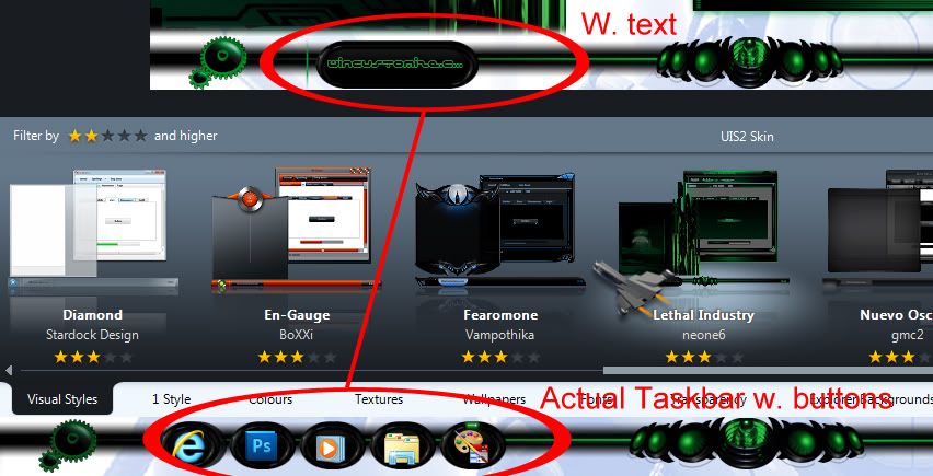
Design : Start Menu and Taskbar


One Piece At A Time : Windowblind Tutorial Part II

Design: Title Bars & Window Frames


One Piece At A Time : Windowblind Tutorial Part II

Design: Edit Controls


PLEASE :

  • I am open to suggestions but may not use any of them. Please, don't be offended if I don't use yours.
  • Keep the image posting to the skin(s)
  • If you want to make a skin to go with this, PM me for the files. My PSD's tend to be a mess, but I save everything and will be happy to     share. I am uploading the actual files to the Graphics Gallery here on Wincustomize.
  • We'll be skinning for Windows7, maybe Vista. If someone wants to do XP, PM me and I will get you what you need.
  • Any files you request will come as I complete them. I won't be jumping ahead. Please be patient.
  • ;)

-----------------------------------------------------------------------------------------------------------------------------------------

The PSD files for the  previous threads are in the Graphics Gallery.

Roan WB Title Bars and Window Frames  

  Roan WB Taskbar Buttons

Roan WB Title Bars and Window Frames  

  Roan WB Taskbar Buttons

113,301 views 203 replies
Reply #76 Top

Quoting PoSmedley, reply 75


But how are these going to look in Vista with text?
Skinstudio "Stretches them automatically...Wait I´ll show

Reply #77 Top

This is what will happen when applied w.text..... Painting margins are CR U C I A L here ! Perfect example :cylon:

Reply #78 Top

Reply #79 Top

Quoting neone6, reply 76
Skinstudio "Stretches them automatically...

I know. I meant..the text color, sorry.

Reply #80 Top

Quoting PoSmedley, reply 79


Quoting neone6,
reply 76
Skinstudio "Stretches them automatically...


I know. I meant..the text color, sorry.
P O . . .

That should be a minor problem since there´s a couple of nuances to choose from in the colorwheel :thumbsup: :waaaa:

Reply #81 Top

Quoting PoSmedley, reply 79
I know. I meant..the text color, sorry.

omg NOW you want us to choose COLOURS for you as well?!?!? :rofl:

Reply #82 Top

This is gonna rock!

Reply #83 Top

Quoting Vampothika, reply 81

Quoting PoSmedley, reply 79I know. I meant..the text color, sorry.

omg NOW you want us to choose COLOURS for you as well?!?!?

I'm looking at the difference in the buttons highlighting where a dark text will work on one and a lite text won't and vice versa. JUst afraid of text washing out.

Reply #84 Top

Quoting PoSmedley, reply 83


I'm looking at the difference in the buttons highlighting where a dark text will work on one and a lite text won't and vice versa. JUst afraid of text washing out.


welcome to the world of skinning !  ;P

Reply #85 Top

Quoting PoSmedley, reply 83
I'm looking at the difference in the buttons highlighting where a dark text will work on one and a lite text won't and vice versa. JUst afraid of text washing out.

normal state and flashing button use the same text colour,

there is no reason why you cant use different text colours for the other states....get what i mean?

Reply #86 Top

Did I miss a day?  Dammit.

For Satureday:

Quoting PoSmedley, reply 47
Of course, I have to hear from Zubaz that someone else made the damn buttons and is doing all the work.
 I'm startign a list of "contributing artists".  That's cool, right?


For Sunday:
Crap.  The skin is awesome looking.  It's getting harder adn harder to find shit (not "the shit") wrong with it (or you). 
On the bright side, no matter how good looking this skin is or how useful this process is for other artists, you Po', are still and ugly muther and no one likes you. 

Reply #87 Top

I like Po :sun:

Reply #88 Top

I like them the way you originally designed them. I was trying to avoid a lot of flash/gloss/metal but they work well on the window frame. I want to keep them uniform if I'm gonna use them throughout. I think it will look cleaner and neater as a whole skin. Does that make sense? Plus, I think it helps with the text issue and keeping that somewhat uniform. I didn't want to get into multiple colors for the text. Dark where I needed it and light where I needed it.

I'm open to hear yours or anyone's thoughts or preferences.

*EDIT - the far left button on the bottom is just a quick example. I want it to look like the change I made to the 'log off' button on the start panel.


*geez. all this freaking time on buttons! buttons i thought were done, yet! you're ears have got to be burning by now. ;)

Reply #89 Top

Quoting Zubaz, reply 86
On the bright side, no matter how good looking this skin is or how useful this process is for other artists, you Po', are still and ugly muther and no one likes you.

Translation from Derpish : "Yes, Po. Please post the video of me that you altered to share with everyone."

 I thought you'd never ask. :grin: }:)

Reply #91 Top

Quoting PoSmedley, reply 88


 I want it to look like the change I made to the 'log off' button on the start panel.
Then you should go with that. You seem to have all the graphics to fix it or ?  Just say the word and I´ll help you with whatever.:grin:

Reply #92 Top

Reply #93 Top

Can you see the difference in top and bottom button or is it just too much detail?

Reply #94 Top

I don't see any difference.

Has a classic look to them.

Reply #95 Top

Quoting PoSmedley, reply 93
Can you see the difference in top and bottom button or is it just too much detail?

I know you are waiting for Andrew to answer but my thoughts. Things are made to be changed. If you like it then go with it. It's really about what you want it to look like Po. I think it looks good and others may also. On the other hand some my think that maybe it's a bit much. Go with your gut.

BTW: I'm signed in but for some reason I have add on all the forum pages only. What's up with that.

Never mind they just decided to go away.

Reply #96 Top

Quoting PoSmedley, reply 93
Can you see the difference in top and bottom button or is it just too much detail?


We don´t understand what you mean , but the left non bulgy one is the one to go for...Definitely.

Reply #97 Top

 I like those taskbar buttons but......


Unless it`s been fixed, the left and right text margins on taskbar buttons cannot be changed. You have about a 2 pixel margin on each side of the button....that`s it.


I can`t say I`ve attempted it recently...because it never worked.


Sorry :pout:

Reply #98 Top

Quoting DaveBax, reply 95
I know you are waiting for Andrew to answer but my thoughts.

I'm asking anyone. When I want his opinion, I'll get it from Kitty. ;) 

Quoting neone6, reply 96
We don´t understand what you mean
(couldn't resist)

It's subtle. I have a lot of little detail in there to give it the effect. I changed the texture on the bottom set buttons so they would stand out a bit more.

Quoting neone6, reply 96
the left non bulgy one is the one to go for

Yeah. That one looks better. ;)

Quoting 2of3, reply 97
You have about a 2 pixel margin on each side of the button....that`s it.

Now I have to go looking. I know when I was trying to do Vista I was able to move it.


Reply #99 Top

Quoting PoSmedley, reply 98


Quoting DaveBax,
reply 95
I know you are waiting for Andrew to answer but my thoughts.


I'm asking anyone. When I want his opinion, I'll get it from Kitty.  

4 Real :rofl:

Reply #100 Top

Okay. I had to log off and reboot in Vista. Keeping the wise cracks to a minimum...this is a skin i tried in Vista. On the Taskbar, I was able to adjust the text. I think the issue was that I lost some of it but I don't think it looks awful or anything as far as doing the same thing with Roan for Vista.