
Start11 - Feedback on Start Menu item menus
 Stardock Forums
Thanks for a great product! There's just one annoyance I can't seem to figure out. Is it possible to disable items listed in the right click menu on the start menu or apps/icons ?
I am all for a clean and tidy design that is neither busy nor overly exhausting to look at or use.
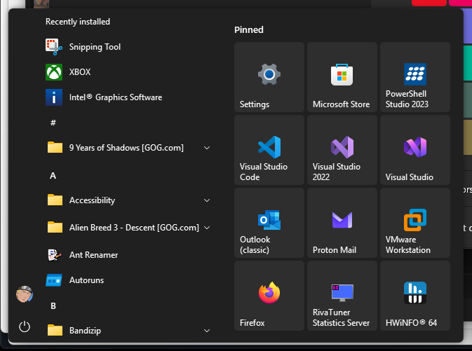
But then I right click a random item in the All Apps section and I'm instantly overwhelmed with irrelevant options:
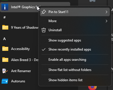
Like, the only options in this menu here that's actually relevant to the app I right-clicked on is the three first items. The remaining 5 items (all Show.../Enable... items) are of no concern and I will never click on them. Why are they even a part of this app menu?! They should only be part of a regular "empty space" context menu (e.g. right clicking between items, on the scroll bar, to the left of the All Apps section, etc).
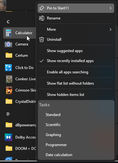
This also ends up harming the Jump List feature of applications. Like, take Calculator as an example. Why are the jump list Tasks (or Recent or Featured) pushed all the way to the bottom of the list and separated by a massive canyon of irrelevant options that doesn't pertain to the app? Please clean the app context menu up and remove all of the irrelevant items and move them somewhere else!
And if you right click a pinned item is actually even worse!
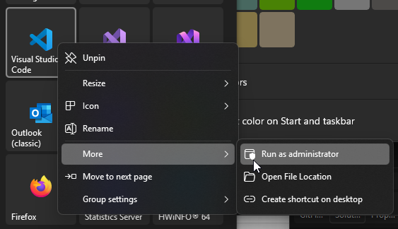
Why are the options I actually want thrown into a random More submenu?! Why is most of the immediate menu when right clicking on an actual application dedicated to options that the user can be expected to use the least number of times?! How often do you expect users to resize/rename/change/move the app icon? The Unpin option here is the only one that makes sense -- all of the other ones should really be thrown into a submenu. And why is the hell do we have another "Group settings" submenu here as well?! I didn't right click on the group or its header -- I right clicked on the application.
The whole right click menu seems to have gone for the opposite approach -- the options that you would expect users to use the most during regular computer use (Run as Admin, Open File Location, Create Shortcut [this is redundant btw]) are permanently deprioritized while the options that's only really relevant during initial creation/setup is permanently prioritized.
I do not want to say "look at what Microsoft's doing" but in this case they actually strikes a much better balance in regards to what items are exposed and accessible from where.
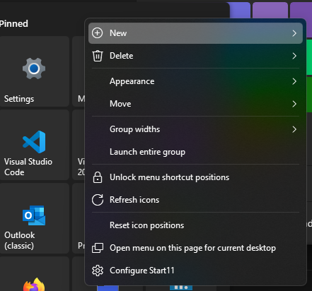
If you can't figure out how to solve all of this then do the usual and cheat by adding a proper "view/edit" toggle for the Start Menu that's exposed in one of the "empty space" context menus. Like, take this menu on the group header as an example. This is another case where I don't actually care about any of these options other than "Configure Start11" which I might use once every half-year. You already have an "Unlock menu shortcut positions", why not just have a proper "Unlock customization" toggle that controls the appearance of all of these Start11 related options? So this menu, in a lockeds state, would just result in two items: "Unlock customization" and "Configure Start11". And if you tick "Unlock customization" you get this hellscape of a menu back. Same with the other menus, if you're in an unlocked state, all of your annoying never-used options are restored and visible and if you're in a locked state they're all hidden (except for pin/unpin I guess).
Good app overall. It took some testing and tinkering to get it mostly perfect but nowadays it is almost near perfect. I just don't get why the menus are this annoyingly busy by default even though I'm not in any "edit mode" (nor have I been for almost a year now).