Developer's Log (August 2016)
I realize this is WIP, so maybe some/all of my comments are irrelevant.
How hard would it be to get rid of this loading screen and replace it with s.l.o.w.e.d down zoom-in to planet cinematic with planet features and UI populating the screen in a cool animated manner while the stuff is actually loading? Actually, why can't the whole Star System be pre-loaded, so everything inside the system is smooth and uninterrupted transitions without any real or fake loading screens?
Overall Solar system travel zoom is too abrupt? to my liking. Can it be made more dynamic/smooth as in fade in slowly - fast - slowly fade out? Same time spent as in WIP, but have more "elastic" feel to it. Like if it's a zoom in on a planet it should create a feeling of a planet sucking you in.

I like the current UI as is (general font is perfect). Clean and simple. I really like the existence of Planet Type icon. It adds flavor. Will there be mixed type planets? That'd be super cool! Maybe Weather and Biology can have their own icons? Same simple style as Planet Type icon. Love those. We should see our lander here in orbit getting ready to jet down, maybe?
Scan and Launch screen buttons are not necessary. Can be assigned to LMB and RMB or gamepad A & B. In an ideal world I'm for auto-scan where as soon as your Planet Exploration screen is fully loaded resource and POI flags start popping up in a cool animated manner accompanied by cool sounds and alarms if something amazing is discovered. Wouldn't you need to press scan button everytime you're at the planet? What's the advantage of not scanning the planet? That's why auto-scan, basically.

I assume controls will be completely customize-able, 'cause WASD + Right Ctrl aren't exactly made for each other. Also, the lander should definitely bobble/"lean" a bit more when maneuvering. The atmosphere pop-in is frikkin' genius! I can only imagine landing in the eye of a hurricane just to be swung out like a rag doll. j/k... not really.

I assume the alien dialog screen background 2D image is just a place-holder? 3D is definitely preferable and interactive 3D is even better. Doesn't have to be a lot. 3-5 spots to click on for maybe easter eggs or other comic relief. 

I like Super Melee angle for star system exploration screen better. Current star system tilt is a bit too much. Not critical though. I don't think we need to see planet features when in Star System view. It makes planets look extra silly than they already are. Maybe replace them with semi transparent atmosphere?..
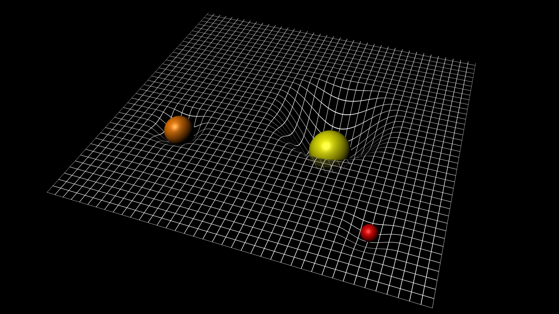
Super Melee Gravity Grid though... I don't know if there's real need for it. Isn't player gonna develop a feel for gravity wells as he plays? Why the Star doesn't have gravity? Is it gonna insta-kill you if you run into it, or just kill the crew?
Mushroom planets => Exploration under influence (EUI) => High amounts of serotonin => Profit. I like the art direction personally. Moar eye-candy! Particle and all kinda glow and shadow effects.
Overall, I'm loving what I see. Nothing reject-able so far.


 good read