teddybearcholla teddybearcholla

Wallpapers in progress

Wallpapers in progress

For those wanting serious critiques only!!

 Thought I would start this thread in the hopes that there will be good and serious critiques.   I can be your first *victim* IR  or whomever wishes to give me direction!!!  ;) :w00t:   This is in progress....it is a photo I took and then added the little ghosties...which may or may not work. 


461,607 views 268 replies
Reply #151 Top

I would just like to point out that tbc started the thread for critiques.

Not everyone is right and some critiques could be against what your ideas are. Take out what you think is good, ignore the bad and learn from others' opinions.

It will only make you a stronger artist ^_^

Reply #152 Top

So, anyone: Where did I go wrong with this? The transparency in the brushes?

Reply #153 Top

The transparency of the brushes, definitely, but also the blurring of the background seems unnatural to me, and (this could just be my tastes), it BEGS for something big, and focused in the middle.  The trees are pulling my eyes to the center of the canvas; the hawk is too high for that focus to be satisfied.  Perhaps a huge setting sun at the horizon line (of course, then you would have to do more with the sky).

Reply #154 Top

First mistake...mirrored trees.....another common fault with copy/paste.

No two trees will be alike, and your audience won't be tricked by/with mirrors.

The grass/ground has no substance...unless the intent is to represent trees growing on grassy [ish] clouds...;)

Reply #155 Top

The trees are brushes, but yes I did use the same brush on each side adding more to the left side. I was attempting to create the ground cover with only brushes and texture but I grab from what you are saying that I went too soft with it. I was going for dreamy but I guess the whole image is too soft. Did I interpret correctly?:meow:

Reply #156 Top

I think if you're going to go dreamy, then everything needs to be soft.  The hawk is super sharp, so the dreamy effect comes off looking a little dirty.

Reply #157 Top

There's the fundamental issue with 'brushes', as with all image generators.

Traditional 'art' would see a 'brush' as a stick-with-hair-attached - used to apply individual strokes from personal, human input/creativity.  There can be NO repetition of 'pasted' images without deliberate intent.

If you 'paint' each tree as you would in non-digital imagery....by hand....then there's no danger of repetitive images....;)

Reply #158 Top

I'm not having much success "Painting" with this damn mouse!<3

Reply #159 Top

'Painting' can be done with a mouse...as unlike 'normal' artforms digital 'art' has the option to zoom in on detail.

It is not uncommon for skinners [in particular] to deal with images at an INDIVIDUAL per-pixel level.

This is what often differentiates skilled creativity from 'filter frenzies'....the latter is typified by what was/is commonly refered to as 'blue swirlies' - one of the no-no's of wallpapering....;)

Reply #160 Top

Frankie...the grass/ground looks cloned... the brush or cloning looks artificial because there are no 'identical' plants (like trees).

Reply #161 Top

I have been trying to rework this image. If it's a waste of time, please let me know or if anyone has some useful advice, it would be welcome.:meow:

Reply #162 Top

That is a big improvement!

There seems to be something not quite right about the clouds. If you are going for a foggy look, maybe make the clouds less "puffy" looking, more hazy...and the farther you look into the distance, the less you should see.

If it's a partly cloudy day, I would suggest geting the clouds off the water and giving them more depth, maybe with more layers of them and more light and dark parts of them....if that makes any sense.

Reply #163 Top

Actually, at the moment all I have are rendered clouds as I was spending so much time on it, I wanted to know if it had potential before I did anymore. I was thinking to blur the water line and add more clouds. As I said, right now it is just rendered clouds with a gradiant mask. I learned quite a bit about using masks in some tutorials yesterday while my system was down and I was using the "ancient one" which:meow:   won't run photoshop so it forced me to stop trying to create and try and learn something!

Reply #164 Top

I think it's worth persuing.

Reply #165 Top

Grass in the middle is flat...2D....the bit to the right side is better.

The clouds between the viewer and the water look more like smoke.

The 'grass' "brush" is still evident..... identical bits of grass....rather unlikely.

Reply #166 Top

MUCH better, Frankie! :thumbsup:   
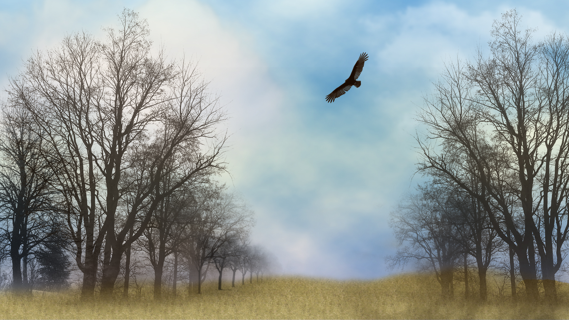
Maybe cast a faint shadow of the hawk on the water.  I agree with the Xiandi, that the clouds need work.  Could you bring in a cloudy sky stock photo rather than render clouds?

Reply #167 Top

I was trying to keep it stock free if I could. I have done some clouds, now tell me what you all think. Jafo, you are a hard man to please! I will revisit the grass tomorrow. ( and maybe the clouds too!)

Reply #168 Top

Maybe cast a faint shadow of the hawk on the water
To me, it looks like the hawk is just above the edge of the water and the land, therefore you would not be able to see his shadow...besides, it kinda hazy and that would filter the light, making the shadow pretty much invisible.

The clouds do look much better now, much more depth to them. IMO, I think the part of the clouds that is kind of peach color should be desaturated a tiny bit as it gets closer to the water, the sunlight would fade a bit there because it has to go through the fog. The peach up high is great.

The improvement from the original is quite dramatic now. :thumbsup:

Reply #169 Top

Well, thank you for that. It was headed for the recycle bin but perserverence won out.I did add that tiny bit of reflection under the hawk and thought a shadow would be overkill.  Not quite sure how to desaturate part of that layer and not the rest. It's late and I'm tired! I'll leave it go til tomorrow and see if I can change up the grass a bit.<3

Reply #170 Top

Quoting Xiandi, reply 168

To me, it looks like the hawk is just above the edge of the water and the land, therefore you would not be able to see his shadow...

I guess you're right.  I need new computer glasses.

The improvement from the original is quite dramatic now.

I agree.

Reply #171 Top

Perspective reads there will be no reflection of the hawk....

Reply #172 Top

Big improvement, Frankie! :thumbsup: :)

Reply #173 Top

I've done a bit more refining and tried to change up the grass. I guess the tuts I read on doing grass were all wrong, Can someone suggest a good site for Photoshop tutorials? I know there are scads of them but which do you think is the best or that you would use?

Reply #174 Top

frankie, i would be moving the trees from the eges, they keep drawing the eyes to the edges of the wallpaper and not to the centre.

my eye direction goes in this order,  tree, edge. bird, tree, edge, water, tree, edge.

sounds stupid i know.... but your main aim is to have the audience attention on what you want them to look at most, in other words, what is your focal point? and make the surrounding images force the eyes to centre on it. xxxxx

if your bird is the focal point, you need to truly change the trees, they are too dominant..

 faint mountains on the other side of the river would aid as an arrow towards the bird (why as an arrow? because a mountains goes straight up

and so will the eyes)

Reply #175 Top

i would also be adding light to the trees, bird, grass ect from where the light is coming from, this will give it more depth and more oomph.