djcityscapes djcityscapes

Fangorodrim

Fangorodrim

New game (freeware)

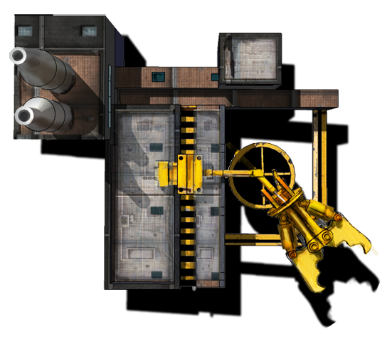
Here is the game I've been working on since the beginning of April:
Fangorodrim.zip (13 megs)

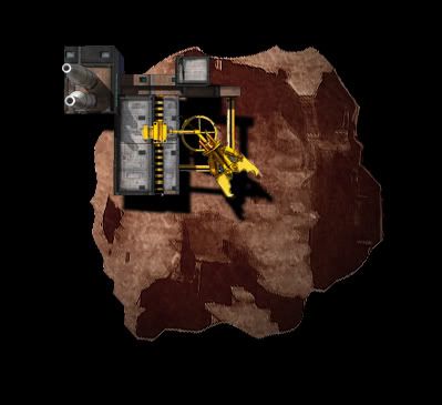
This is a real-time strategy game inspired by Sins of a Solar Empire. I'm looking for feedback on where to go next with this. All of my original goals have been met.

Its difficult to know if the game play is balanced. After 1000 games I have no idea if this is too easy or impossible to win or simply no fun to play. My perspective is shot.

Notes:
1. You win by colonizing all of the sectors.
2. Should take about an hour to win.
3. Freeware game made using Torque Game Builder
4. Looking for feedback and bug reports.
5. This is a simplistic game made by 1 programmer and 1 artist.

Please let me know if you have any questions.

486,364 views 156 replies
Reply #126 Top

The latest version has the new kazi graphic (excellent!) and the Ghost alien fades in and out. Plus some other minor changes:

Fangorodrim.zip (v1.55)

Reply #127 Top

the ghosts look much better with the fading out. really good.

something that i have no idea how i havent noticed till now: there seem to be a red overlay on top of all the alien ships, while its ok in most of the aliens, it really "kills" the new kazi, as i made it with orange spots to try and convey as if it has a giant fireball inside of it, its also flattening the ship because some of the subtle shade is in a diffrent hue.

Reply #128 Top

That's something that happens in the Alien Nest sector. Otherwise, there should be no color change in the rest of the sectors. I did that on a whim long time ago, I'll turn it off in v1.56.

Edit: I did find another place where it changed the kazi color everywhere. I'll disable that also.

Reply #129 Top

Fangorodrim.zip (v1.56)

The Kazi looks a lot better now:

Also, Mining Stations must be built on asteroids in this version. Only about half the sectors get asteroids. What did you have in mind for Power Plants? Only built on nebula or something like that?

Reply #130 Top

agreed, the kazi looks much better now.

something about the asteroids doesnt look right, maybe they are too stretched, maybe too photorealistic, they doesnt seem to fit the game, graphically wise.

as for technically, i like this feature, how are they placed? randomly or pre existent? because i played 2 games where they werent on the same spot.

i think they can be even further away from the star.

as for the energy, i fear that the nebulas would be hard to read against the stars background.. maybe we should come up with something diffrent and maybe unique.

i did a verion of the mining station. tell me if you like the style, if you do, i could make the rest of the buildings as well with this style in 3d.


Reply #131 Top

That Mining Station is awesome! For multiple reasons: 1. I love the perspective, 2. It works with the current special effect and 3. I can replace it right-away since it doesn't completely clash with the other art.

I agree the asteroids don't look right. Their placement is random, within bounds but I can adjust the bounds. Can you make a generic asteroid that fits? If you give me a basically round one, I can code it so that width and height are random and it would always look different.

Energy: mini black-hole?

Edit:

Here's how the miner looks in game (zoomed-in):


I think some of the detail gets lost. This might have to be twice as big to look good.

Also, I have to add 2 frames for the build and research icons, like so:


Left: can not build or research

middle: permitted to build

Right: permitted to research


I stretched it out a bit here. This looks much better. Maybe it doesn't have to be twice as big:

Reply #132 Top

i think we can cheat here a little bit, look how the shadow helps to distinguish the mining from the asteroid and helps to define a false perspective.

you dont even have to match it with the 2 other frames for the build and research.

about the energy sources, i was thinking some sort of black holes as well..

Reply #133 Top

Yes, the shadow helps make it stand out better. And the new asteroid looks excellent! Do you want to play this version now or should I try to find a stock image of a black-hole and get the energy resource zones completed?

Reply #134 Top

i am in the process of creating the power plant and the def drone in the style of the mining platform, so i guess we could wait with the next version for them

Reply #135 Top

I can't wait to see them!

By popular demand the next version will display a tutorial when a player selects "new game". Apparently this game is much harder than I thought.

Reply #136 Top

ok, heres the power plant, i tried to stay as faithfull as possible to your power plant genreal contour while adding depth and details.

i must say i did the build and research frames quite horribly.

let me know what you think. btw - i am half way through the def drone.


Reply #137 Top

This looks really good! btw, I dont expect you to make the other frames. I apologize if I implied that. It only takes me a few minutes to apply the masks and create what I need.

Reply #139 Top

Oh, this is suh-weet! I'll have v1.57 uploaded soon.

The tutorial is just a document that pops up. The player can read it or exit and move on.


Fangorodrim.zip (v1.57)

Besides the new buildings, which look fantastic in-game, the font is much improved. I think ZehDon will be pleased. Where are you ZehDon??

Reply #140 Top

the mining factory looks good. the power plant is ok, i am thinking about removing the blue circlers and enlarging the energy tube, as they look too static when the animated effect in the middle plays and  the def drone needs  som work, it is barely recongnisable in game. maybe i'll enlarge the missile in the center.

the font looks good, i think the asteroid looks great ingame, maybe make smaller, seperated ones in a sector?

edit - after another game, i moved editing the formation editor to the top of my priorities list.

i also think we should examine an alternative to how the sectors map appears and refining the build and research interface, especially the text itself, as this yellow, heavy, san serif font isnt too clear.

btw - the background called background2 in the game images folder is a mighty fine looking one. i will add making some bakgrounds in the same style to my to-do list, altough, that will have to be at the bottom of the list..

Reply #141 Top

I'll increase the drone size in the next version and see how it looks. Working on the blackhole energy zone now.

Edit: I finally nailed that bug with the ship names. Also, we can scuttle buildings and ships in the next version. I have the blackhole energy resource working, but... I'm afraid it looks like a giant donut and not a black hole.


Reply #142 Top

heres the new formation editor, its exactly the size of the former, so you wont need to make any adjustments... i think.

i am not yet fully happy with it, but this will do for now.

-- edit -- just tested it in game, it is so much better now. one thing that bugs me now is the red overlay background, while it is really great under the blue transparent circle, outside of the editor graphics its just looks out of place.

show me the graphics of the black hole, maybe i could manipulate it.

i stumbled upon the fangorodrim thread in bay12, and i kinda liked the ideas that this one guy did the mocks up for. (well, more of a really rough mspaint mockups, but he got the ideas through non the less). i am talking about making the research more of a research tree type.

i will do a mock up of my own that will hopefully wont force a major change in the UI.

Reply #143 Top

Fangorodrim.zip (v1.58)

-new editor screen
-right click to scuttle buildings/ships
-def. drone 25% bigger
-power plants must be built in black holes.

Behold the black hole:

What, no sprinkles on that?


Reply #145 Top

That blackhole is 300% improvement! That's amazing how you manipulated the big donut ;-)

Edit: The next big mod on the list is Trade Port with automated trade ships. To make room on the side bar,  I'm thinking about scrapping the Elite Academy because there's really not much value added benefit to it. Thoughts?

Reply #146 Top

Screenshot of v1.60 with blackhole:


I think the original goal behind resource zones have met expectations.

Reply #147 Top

I just tried out your game for 15 minutes or so and it seems like it will be fun but I need more time with it still.  One thing I would like to see though is to be able to reconfigure the controls.  I find strafing with Q and E and turning with A and D to be backwards.  Others may like it that way but it's a pain for me.  Would recommend adding the ability to remap before releasing it.  Awkward controls is one of the biggest turn offs for me.

Reply #148 Top

I did not get elite academy at all when I played this. I did not really see an immediate need for it.

You could raise the price for it and make it lower the time needed for research. If you wanted to go with the research tree, that would be a good idea.

Reply #150 Top

i started to sculpt in 3d this alien ship for the victory screen, plan is to see it from below while 3 escort ships and the dread tearing t with missiles.

i think this B&W verison could look nicely in the story screen, i have started to dislike the alien there.